Making The Teaser Trailer
We were told to make a trailer out of a short film that had no campaign. Our group chose to make a trailer for HYBRIDS. it seemed more challenging then the other as it had more information a trailer could put in.
The story is about aliens coming to earth looking for ‘the key’. The main character has a daughter and she is killed as an alien eats her thinking she is the key. After the trauma she decides to take things in her hand and goes hunting for aliens.
 As a group we looked at the teaser trailer of A Walk among the Tombstones among others and analysed the forms and conventions. This helped us understand how a thriller trailer is made. With all our knowledge we moved on to the next task which was HYBRIDS.
As a group we analysed the film and picked out scenes we felt were good to put into the teaser trailer in order to meet the forms and conventions of one. We print screened the scenes we would include and made a picture trailer showing what order we will set them in.
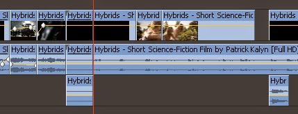
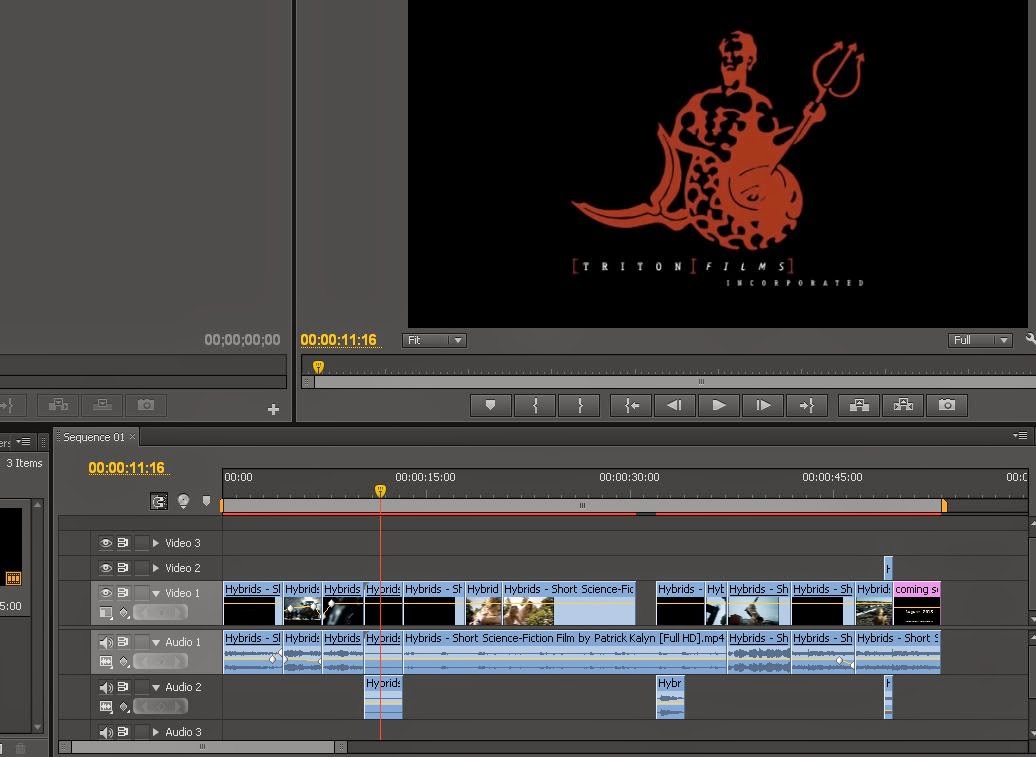
After this we went to the editing rooms and started. At first we just gathered all the scenes were going to include and we noticed that the original plan needed to change as when you edit you notice other scenes you would like to include. For example (00:31) to (00:35) of the trailer was just supposed to be a voice over of the main character talking in the background while the shot of her holding the gun was being shown. Instead we decided to add a blank screen for 2 seconds adding effect.
 The next day we focused on the soundtrack editing in between scenes. The soundtrack was challenging because the original soundtrack was playing in the background while the women was talking. The soundtrack was already in the original film. We noticed a scene where the woman is not talking and the soundtrack is playing and with this we added it into the background where the production logo appears. The last shot was originally supposed to be just of the aliens coming towards her but we liked the idea of showing the close up of the grenade about to be set off.
For the last shot of the release date we had different ideas as to what we were going write. As you can see we first thought of a release date and add the website. There were two reason we didn't like this.
1. The the layout of the text did not match the theme or title
2. In a normal teaser trailer you wouldn't have the release date until the theatrical trailer come out
After this we decided to look up a different font and we found 'OCR A Extended'. we really liked the font and we also used it for our poster.
Hybrids Teaser Trailer
We start the teaser trailer off by showing the caption
informing the audience about what happened before the present day in the film.
The next scene is of aliens talking about ‘the key’ to give the audience a
little about what the main point of alien’s arrival is. the antagonist which is the alien has more power of the aliens, he seems to want the key and do whatever it takes to get the key.
The main protagonist is shown with her daughter and in the
background her voice over talking about ‘the key’. The scene is sweet showing
what the main protagonist life was before the aliens entered her life and this
is one of the main conventions as we get to find out about the characters. Her
daughter disappears. This leaves the audience confused as they don’t know where
she has gone.
The next scene is blank and then shows the main protagonist holding a gun. This is now the protagonist trait which is her being resourceful throughout the film.
We see a shot of her knife covered with blue like blood and then next moves to an
action shot of her attacking the aliens which is a peak of action for the
audience as there will be more if they go watch the film.
Lastly the title appears which is to show that the trailer
is about to finish and then the shot of the aliens appears leaving the audience
excited to see what’s to come as the main character may die leaving enigma
codes. The release date finishes the trailer off and because it’s a teaser
trailer there is not an exact date. This
was inspired by other teaser trailers we watched in class.
Full Theatrical Poster
As a group we looked at Hybrids.
In the full theatrical trailer i decided to make it landscaped because when researching real posters i noticed films like Inception and Gravity have their main posters landscaped and teasers portrait.
Here are a couple of examples:
As you can see the posters consist of
- The main actors name
- Director and productions name
- Title
- Release Date
- Main still from the film for a background
- Most of the time reviews
- Movie Website
- Occasionally a tagline
- Brief information
Our Poster
Next I added in the title HYBRIDS which I took form the film and copying onto my posters as the title of the film the the main convention of a poster. I also copied the actresses name, the productions names and the directors as they are also the main conventions.
With the trailer we made we added a release date so I also added the release date onto the poster informing the audience. To match the title I had to find a similar font and after going through all the fonts I chose OCR A Std. The last thing I added to the poster which was the billing block at the bottom which mostly is brief information on who worked on the film and I found it quite difficult so I decided to copy one from a real poster.
Teaser Poster By Mason
Denotations:
- Background picture of the aliens hand
- Tagline at the top
- Title 'Hybrids'
- Website at the bottom
Connotations:
From the background picture we can see that the film will involve some form of alien creature, but however we cannot see the face so we can't tell what it will look like. But as we can only see the hand and it is climbing up the wall, this is sinister and suggests that the alien will be a villain in the film and not the good guy. We can also see a knife on some army camo on a table, this could suggest that the main protagonist is in the army and is involved with fighting these aliens, this could be why the alien is coming for them.
The tagline at the top of the poster is in the same silver style font as the hybrids title. The tagline helps with the narrative but also provides an enigma, as it says that something has arrived but we are yet to know what has arrived, and what they have been doing for this duration.
The title hybrids is bold and is in the same futuristic look as what the tagline is, this conveys that the film could be set in the future. Not only this but it also gives us insight into the monsters as the word hybrid means a cross of something, so maybe the alien is a cross between human and alien. Another enigma that the poster provides.
The website at the bottom of the poster is in a white font and is also small so that it doesn't take up to much of the space and doesn't attract the audiences attention away from the rest of what the poster has to offer. This is typical to see within teaser posters as where it doesn't give away much information such as the date, the website can provide this information that the poster cannot.


No comments:
Post a Comment